 Switch to M&T
Modal
Modals present contextual information or tasks without navigating the user away from the main task flow. Because they sit on an elevated layer and disable the layout behind them, they should be used for tasks and alerts that require the user's exclusive attention.
Variants
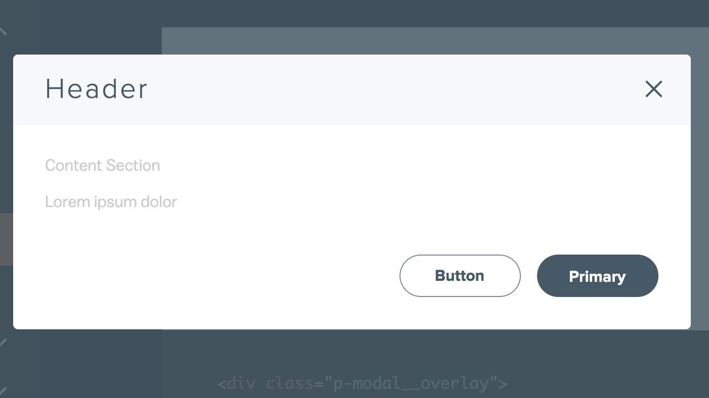
Standard modals allow the user to review information or take action. The required parts are a title, plain or rich-text body content and associated actions. A standard modal may also have a sub-header and a Close icon.
    <div class="p-modal__overlay">
      <div class="p-modal">
        <div class="p-modal__close-bar">
          <h1 class="p-modal__close-bar-title">Header</h1>
          <button class="p-modal__close-bar-button" ><i class="icon icon--close p-modal__close-bar-button-icon"></i> </button>
        </div>
        <div class="p-modal__content">
          Content Section
            <p class="l-margin-bottom--none">Lorem ipsum dolor</p>
        </div>
        <div class="p-modal__footer">
          <button class="p-modal__button">Button</button>
          <button class="p-modal__button--primary">Primary</button>
        </div>
      </div>
</div>Alert Modal
Alert modals interrupt or end a user's task flow to give critical feedback or force an immediate action. The required elements are a feedback icon, a title, body content and a way to dismiss the modal.
    <div class="p-modal__overlay">
      <div class="p-modal-alert">
        <div class="p-modal-alert__close-bar">
          <button class="p-modal__close-bar-button" ><i class="icon icon--close p-modal__close-bar-button-icon"></i></button>
        </div>
        <div class="p-modal-alert__content">
          <i class='icon icon--exclamation p-modal-alert__icon u-color--semantic-orange-base'></i>
          <div class="p-modal-alert__title">Are you sure you want to delete this address?</div>
          <hr class="p-modal-alert__divider"/>
          <div class="p-modal-alert__text">123 Park Ave Ormond Beach, FL 38477</div>
        </div>
        <div class="p-modal__footer">
          <button class="p-modal__button--primary">Call Us</button>
        </div>
      </div>
    </div>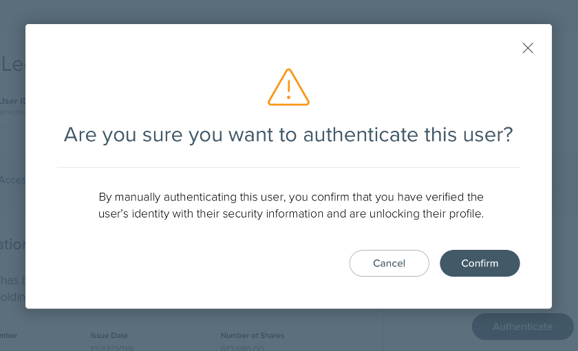
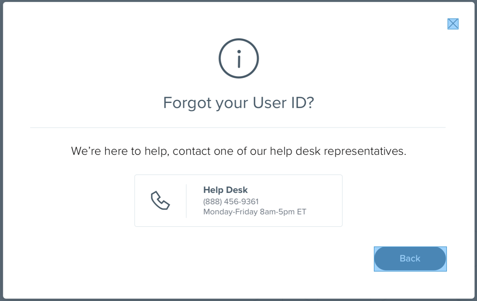
Use warning alert modals to warn of destructive action and ask for immediate user confirmation in instances where the action will lead to data loss. If warning feedback does not require user confirmation, use the Notifcation component instead.
    <div class="p-modal__overlay">
      <div class="p-modal-alert">
        <div class="p-modal-alert__close-bar">
          <button class="p-modal__close-bar-button" ><i class="icon icon--close p-modal__close-bar-button-icon"></i></button>
        </div>
        <div class="p-modal-alert__content">
          <i class='icon icon--info p-modal-alert__icon u-color--primary-base'></i>
          <div class="p-modal-alert__title">Need help?</div>
          <hr class="p-modal-alert__divider"/>
          <div class="p-modal-alert__text">If you're stuck, call one of our help desk representatives to
          assist you in the process.</div>
        </div>
        <div class="p-modal__footer">
          <button class="p-modal__button">Cancel</button>
          <button class="p-modal__button--primary">Confirm</button>
        </div>
      </div>
    </div>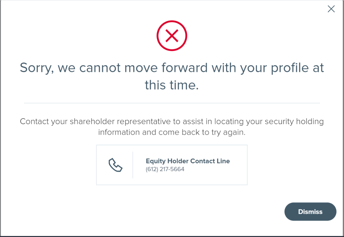
Use error alert modals to tell the user of an error that they cannot resolve on their own. Provide information within the body on how to proceed. If warning feedback is related to an action on the underlying page and can be fixed there, use the Notifcation or Inline Error components instead. To communicate a system error, use a full-page error layout.
    <div class="p-modal__overlay">
      <div class="p-modal-alert">
        <div class="p-modal-alert__close-bar">
          <button class="p-modal__close-bar-button" ><i class="icon icon--close p-modal__close-bar-button-icon"></i></button>
        </div>
        <div class="p-modal-alert__content">
          <i class='icon icon--error p-modal-alert__icon u-color--semantic-red-base'></i>
          <div class="p-modal-alert__title">Your account has been locked</div>
          <hr class="p-modal-alert__divider"/>
          <div class="p-modal-alert__text">You have made too many failed login attempts. Please contact
          one of our help desk representatives for assistance.</div>
        </div>
      </div>
</div>States
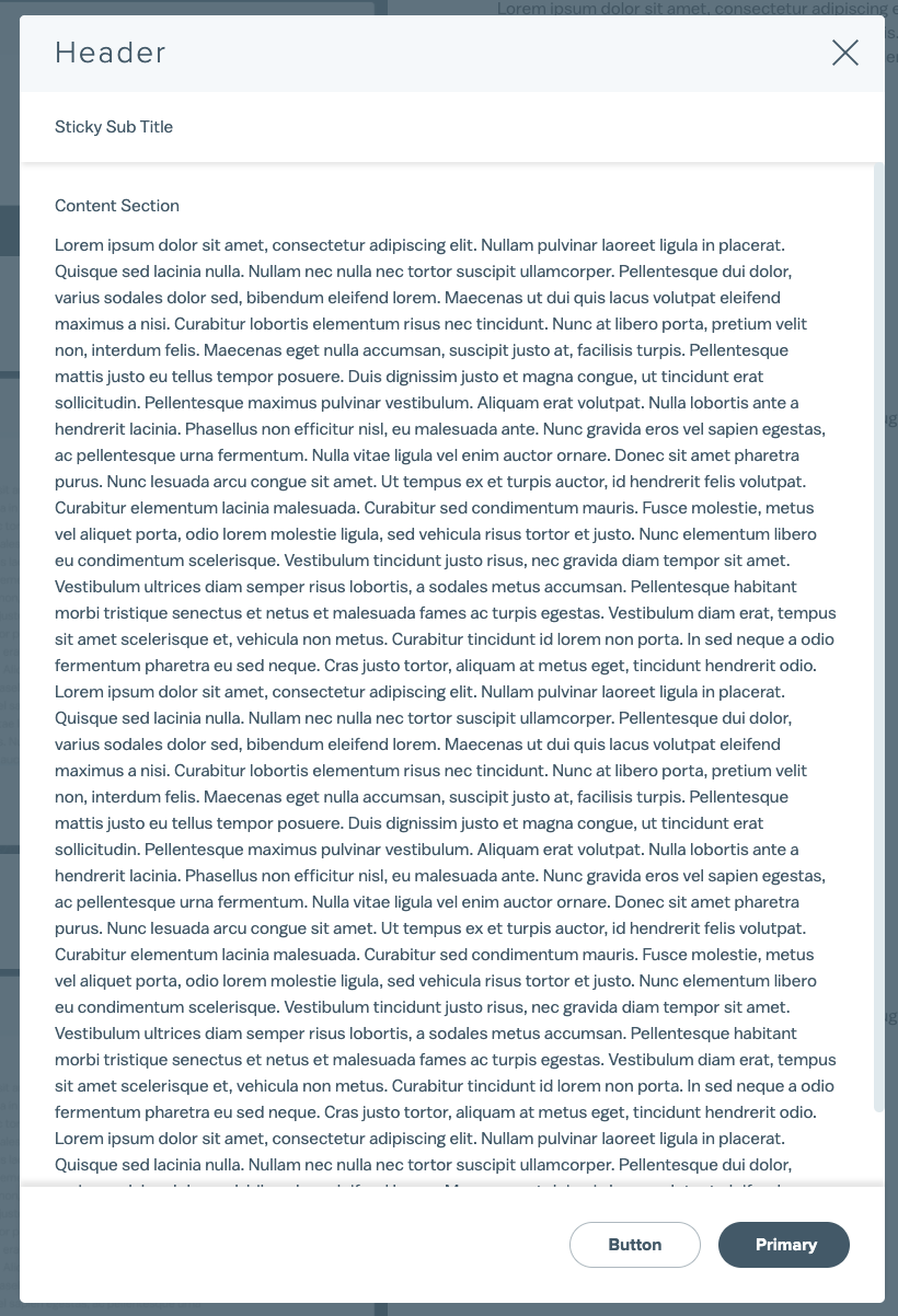
<div class="p-modal__overlay" id="scrollable" >
    <div class="p-modal" >
      <div class="p-modal__close-bar">
        <h1 class="p-modal__close-bar-title">Header</h1>
        <button class="p-modal__close-bar-button" ><i class="icon icon--close p-modal__close-bar-button-icon"></i> </button>
      </div>
      <div class="p-modal__sub-title">Optional sticky subtitle</div>
      <div class="p-modal__content">
        Content Section
          <p class="l-margin-bottom--none">Lorem ipsum dolor sit amet, consectetur adipiscing elit. Nullam pulvinar laoreet ligula in placerat. Quisque sed lacinia nulla. Nullam nec nulla nec tortor suscipit ullamcorper. Pellentesque dui dolor, varius sodales dolor sed, bibendum eleifend lorem. Maecenas ut dui quis lacus volutpat eleifend maximus a nisi. Curabitur lobortis elementum risus nec tincidunt. Nunc at libero porta, pretium velit non, interdum felis. Maecenas eget nulla accumsan, suscipit justo at, facilisis turpis. Pellentesque mattis justo eu tellus tempor posuere. Duis dignissim justo et magna congue, ut tincidunt erat sollicitudin. Pellentesque maximus pulvinar vestibulum. Aliquam erat volutpat. Nulla lobortis ante a hendrerit lacinia. Phasellus non efficitur nisl, eu malesuada ante. Nunc gravida eros vel sapien egestas, ac pellentesque urna fermentum. Nulla vitae ligula vel enim auctor ornare.

        Donec sit amet pharetra purus. Nunc lesuada arcu congue sit amet. Ut tempus ex et turpis auctor, id hendrerit felis volutpat. Curabitur elementum lacinia malesuada. Curabitur sed condimentum mauris. Fusce molestie, metus vel aliquet porta, odio lorem molestie ligula, sed vehicula risus tortor et justo. Nunc elementum libero eu condimentum scelerisque. Vestibulum tincidunt justo risus, nec gravida diam tempor sit amet. Vestibulum ultrices diam semper risus lobortis, a sodales metus accumsan. Pellentesque habitant morbi tristique senectus et netus et malesuada fames ac turpis egestas.</p>
      </div>
      <div class="p-modal__footer p-modal__footer--shadow">
        <button class="p-modal__button">Button</button>
        <button class="p-modal__button--primary">Primary</button>
      </div>
    </div>
</div>Accessibility
Use role="dialog" and aria-modal="true" to convey to assistive technology that the modal content is separate from the rest of the page. Toggle on aria-hidden="true" on the underlying content when the modal is open to trap keyboard focus. To be completely accessible, label the same element that carries the role attribute with a corresponding id attribute on the modal title.