Card Structure
Cards are containers that separate information to either give it prominence within a layout or to creat a predictable pattern for the information. They are hyper-customizable and should include whatever components will best allow the user to achieve their goal.
Structure
The structure of cards is flexible to fit many design needs. They may be elevated or outlined, i.e. distinguished from the surrounding layout with a stroke or shadow. The elements within a card should make use of a logical hierarchy so they are easy to scan. Cards may contain a number of actions in the form of buttons, links and inputs. If there is one obvious action, the entire card can function as a click target.
Grouping
Depending on their usage and the information they display, a card may be used standalone or grouped into a collection.
Standalone
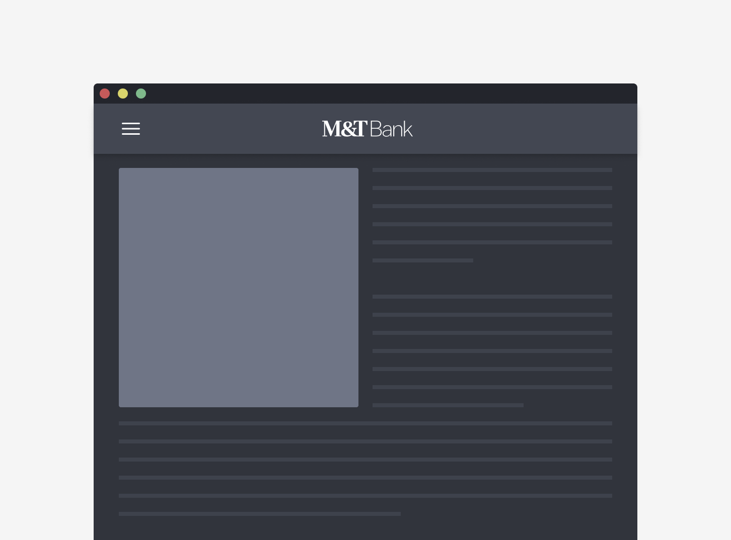
Cards that are used to provide visual prominence to salient information should be used standalone. These cards often have images, larger text hierarchy and singular actions to draw the eye. For an example, see the attention card pattern.

Collections
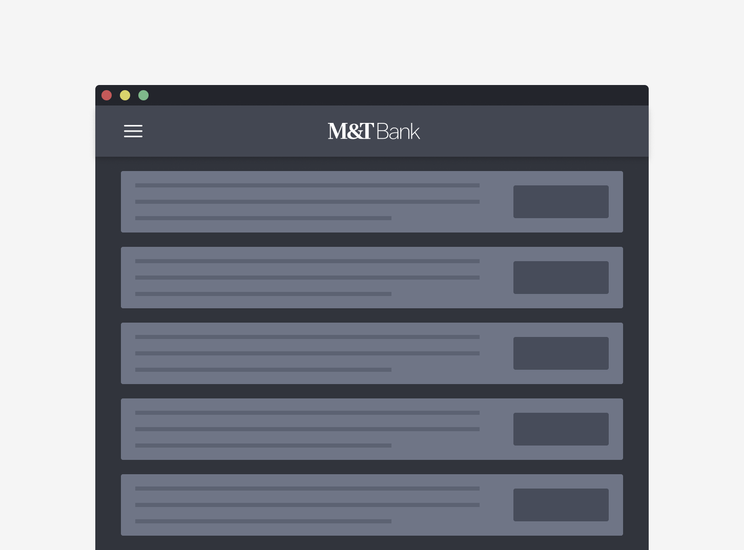
Cards that are used to create visual patterns to display repeatable information are often used in a collection. These cards create visual rhythm that ensures a predictable experience. For an example, see the object card pattern.

Design Environment
Fixed Grid
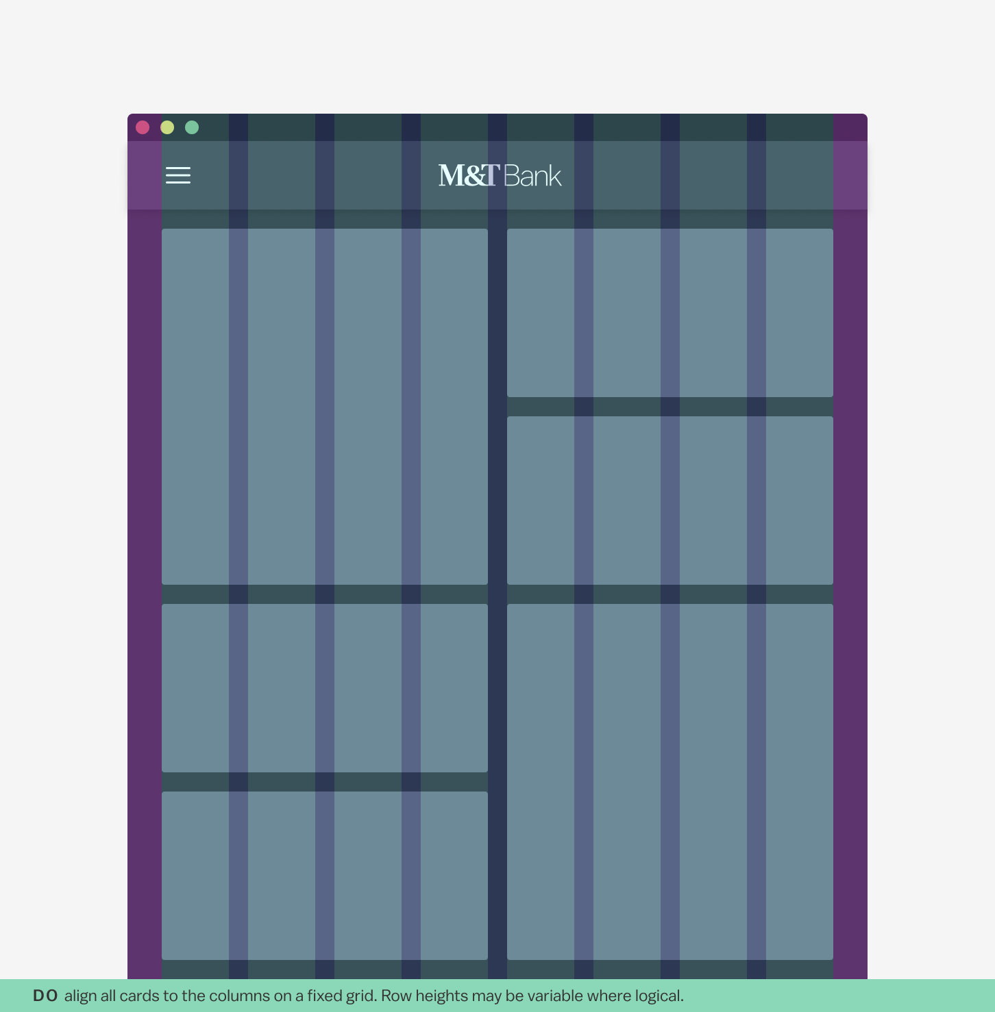
On a fixed grid, cards align to fixed columns and variable rows. This means that all card heights in a row will match that of the card with the most information. All card widths in a collection will be uniform. This grid type creates visual rhythm and makes the information in cards predictable and easy to scan.

Masonry Grid
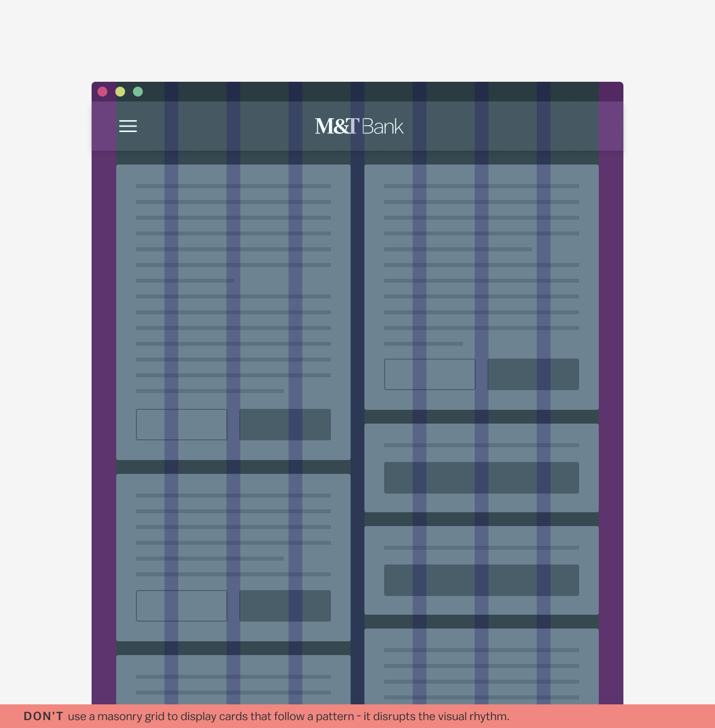
Cards of different sizes may be placed on an asymmetric grid. This grid type is not suitable for text-heavy cards or cards that contain multiple interactions.

Use the grid type that is best suited to your offered interaction. If you are presenting small pieces of consistent information, fixed grids work best for quick consumption. If the user will need to interact with the card for longer periods of time and the amount of content in each card can vary as the user manipulates them, a masonry grid will keep your design more compact.