 Switch to Wilmington
Action Group
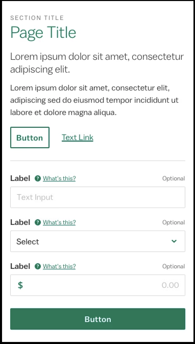
Action groups are a common way to present actions that apply to an entire page or parent element. The pattern includes at least one button and up to one link.
Usage
Used when there are two actions that apply to the page or parent element and when the buttons are small enough to appear inline.
<div class="p-action-group">
  <div class="p-action-group__button-container">
    <button class="c-button p-action-group__button">
      Button Text
    </button>
    <button class="c-button--primary p-action-group__button">
      Button Text
    </button>
  </div>
</div>Used when there are two actions that apply to the page or parent element but button width precludes inline treatement. This variant is preferred at smaller breakpoints but should not be used in full-width layouts at larger breakpoints.
<div class="p-action-group">
  <div class="p-action-group__button-container">
    <button class="c-button--primary p-action-group__button">
      Button Text
    </button>
  </div>
  <div class="p-action-group__button-container">
  <button class="c-button p-action-group__button">
      Button Text
    </button>
  </div>
</div><div class="p-action-group">
<div class="p-action-group__button-container">
<button class="c-button--primary p-action-group__button">Button Text</button>
</div>
<div class="p-action-group__link-container">
<a href="" class="c-link">Link Text</a>
</div>
</div>Used to present a navigational link along with two actions that apply to the page or parent element and when the buttons are small enough to appear inline.
<div class="p-action-group">
  <div class="p-action-group__button-container">
    <button class="c-button p-action-group__button">
      Button Text
    </button>
  <button class="c-button--primary p-action-group__button">
      Button Text
    </button>
  </div>
  <div class="p-action-group__link-container">
    <a href="/#" class="c-link">
      Link Text
    </a>
  </div>
</div>Used to present a navigational link along with two actions that apply to the page or parent element but button width precludes inline treatment. This variant is preferred at smaller breakpoints but should not be used in full-width layouts at larger breakpoints.
<div class="p-action-group">
  <div class="p-action-group__button-container">
    <button class="c-button p-action-group__button">
      Button Text
    </button>
  <button class="c-button--primary p-action-group__button">
      Button Text
    </button>
  </div>
  <div class="p-action-group__link-container">
    <a href="/#" class="c-link">
      Link Text
    </a>
  </div>
</div>Design Environment
When there is no overflow at the bottom of the screen, action groups will appear embedded below and at the same elevation as the parent content they act on. When there is overflow, the action group can be displayed in either the embedded or the persistent position.
Used to continuously show the action group on an elevated plane while the user is scrolling through the parent content. The container is fixed to the bottom of the parent element, fills the full width, and uses a medium shadow. Consider the amount of screen space the stacked dual button and stacked dual button + link variants take up before using the persistent placement.