 Switch to Wilmington
Modal
The modal pattern allows users to review or take action on information without navigating out of the main task flow. Because the container usurps control of the entire window, modals should only be used for information that requires the user's exclusive attention.
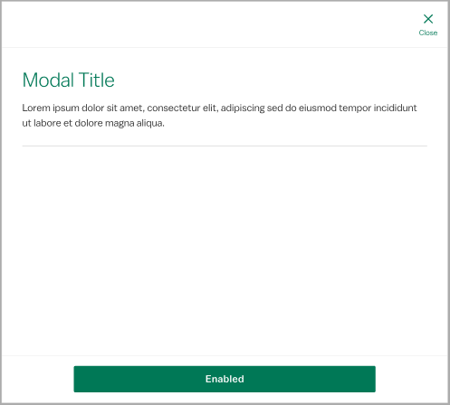
The required elements are the "Close" action, the modal title and body content, which is variable based on the purpose of the modal. Add a modal description to briefly summarize the body content when necessary. A divider may be used to separate the description from body content. The persistent action group allows the user to respond to the modal with actions other than "close."
Variants
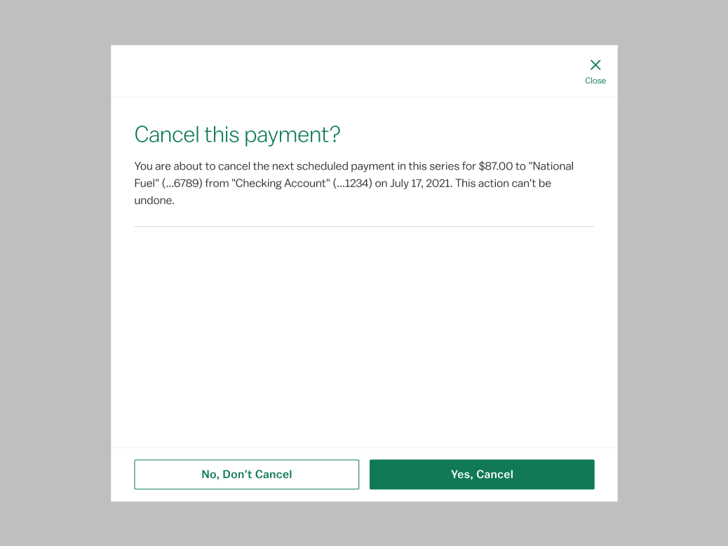
Use the confirmation modal to force a user decision before continuing an irrevocable action, such as canceling a transfer or a session timeout. If warning feedback does not require user confirmation, use the warning notification instead.
States
<div class="p-modal__overlay">
  <div class="p-modal">
    <div class="p-modal__close-bar">
      <h1 class="p-modal__close-bar-title">HEADER</h1>
      <button class="p-modal__close-bar-button" onClick={toggleScrollable} onKeyDown={toggleDefault}><i class="icon icon--x p-modal__close-bar-button-icon"></i> <span class="p-modal__close-bar-button-text">Close</span></button>
    </div>
    <div class="p-modal__content">
      <div class="p-modal__header">
        <h1 class="p-modal__header-title">Header</h1>
        <p class="l-margin-vertical--none l-margin-horizontal--none">Sub-Header</p>
      </div>
  Content Section
</div>
    <div class="p-modal__footer">
      <button class="p-modal__button">Other Button</button>
      <button class="p-modal__button--primary">Primary Button</button>
    </div>
  </div>
</div>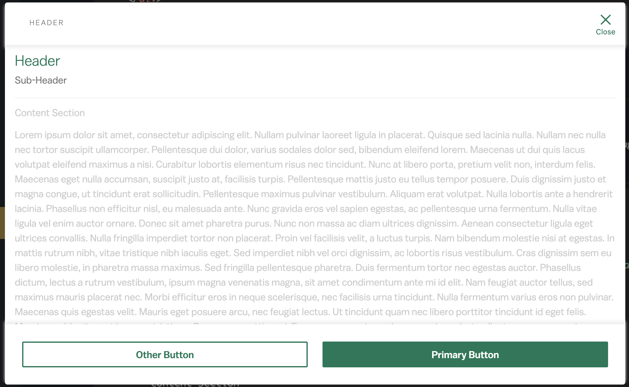
<div className="p-modal__overlay">
  <div class="p-modal">
    <div class="p-modal__close-bar p-modal__close-bar--scroll">
      <h1 class="p-modal__close-bar-title">HEADER</h1>
      <button class="p-modal__close-bar-button"><i class="icon icon--x p-modal__close-bar-button-icon"></i> <span class="p-modal__close-bar-button-text">Close</span></button>
    </div>
    <div class="p-modal__content">
      <div class="p-modal__header">
        <h1 class="p-modal__header-title">Header</h1>
        <p class="l-margin-vertical--none l-margin-horizontal--none">Sub-Header</p>
      </div>
      Content Section
      Enough content for the scrolling to be needed
    </div>
    <div class="p-modal__footer p-modal__footer--shadow">
      <button class="p-modal__button">Other Button</button>
      <button class="p-modal__button--primary">Primary Button</button>
    </div>
  </div>
</div>Accessibility
Use role="dialog" and aria-modal="true" to convey to assistive technology that the modal content is separate from the rest of the page. Toggle on aria-hidden="true" on the underlying content when the modal is open to trap keyboard focus. To be completely accessible, label the same element that carries the role attribute with a corresponding id attribute on the modal title.
Design Environment
Modals can be dismissed in tablet and desktop environments by clicking outside of the container, in the area covered by a transparent gray fill. Modals take over the entire screen in mobile environments, so they can only be dismissed with the "Close" icon. At larger breakpoints, modals take up 70% of the screen width, with a max-width of 710px. Omit the persistent action group from this pattern if "close" is the only available action. Modals should never trigger other modals.
Microcopy
The standard modal description should be as brief as possible, ideally one or two sentences. Try to keep text content in the body concise to avoid scrolling if possible. Otherwise, follow guidelines for the title and button components.
The confirmation modal follows very strict microcopy patterns. The title will always be a question tied back to the action that triggered the modal, e.g. "Delete this payee?" after clicking Cancel. The body will give further context about the consequences of the action, e.g. "You are about to delete the payee National Fuel (...6789). All scheduled payments will be canceled. This action cannot be undone." Buttons are always yes/no with specific actions, e.g. "Yes, Delete" and "No, Cancel".