 Switch to M&T
Card
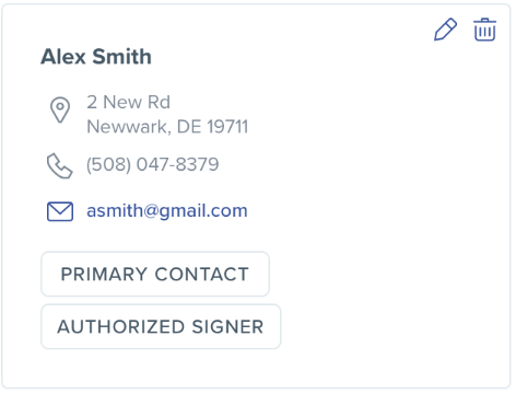
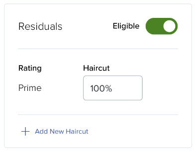
Cards are used to group repeatable content about related items. Each card represents a snapshot of information about one item within a collection.
Usage
The card pattern is customizable to a number of scenarios and should use the design that will create the optimal experience.
- Containers set the boundary of the information within the card. Containers make cards easy to scan and create visual distinction between items in a group
- Titles and Dividers can create visual hierarchy within a card
- Badges can indicate the status of the entity the card describes
- Links can appear in the title or body content to offer navigational or display actions.
- Quick Actions can appear in the top right corner of the card. The actions provided should be simple and common and icons should be easily recognizable. A context menu should be used if there are more than two icon links or if the actions are text links
Although flexible, all cards in one collection should have the same basic layout and component parts. Do not mix card variants within a collection.
Variants
Information Card
Use this card type when the card’s main purpose is to display information. The details provided in an information card may be read-only or actionable.

Interaction Card
Use this card type when the card’s main purpose is to allow the user to perform a task within the card container.
Design Environment
Fixed Grid
Cards align to a grid of fixed columns and variable rows. This means that all card heights in a row will match that of the card with the most information. All card widths in a collection will be uniform. This grid type creates visual rhythm and makes the information in cards predictable and easy to scan.
Masonry Grid
Because interaction cards can grow as the user takes the actions within them, they may be placed on an asymmetric grid that responds to the changing card height, instead of all cards growing to maintain symmetry. The widths of all interactive cards within a masonry grid remain uniform.
Use the grid type that is best suited to your offered interaction. If you are presenting small pieces of consistent information, fixed grids work best for quick consumption. If the user will need to interact with the card for longer periods of time and the amount of content in each card can vary as the user manipulates them, a fluid masonry grid will keep your design more compact.
Microcopy
Refer to the Microcopy guidelines in the Title, Text Content, and Link components for more information.