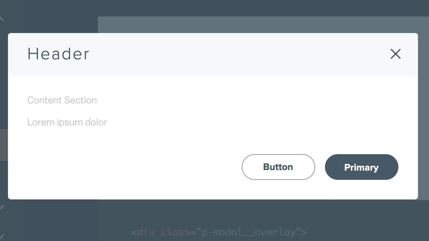
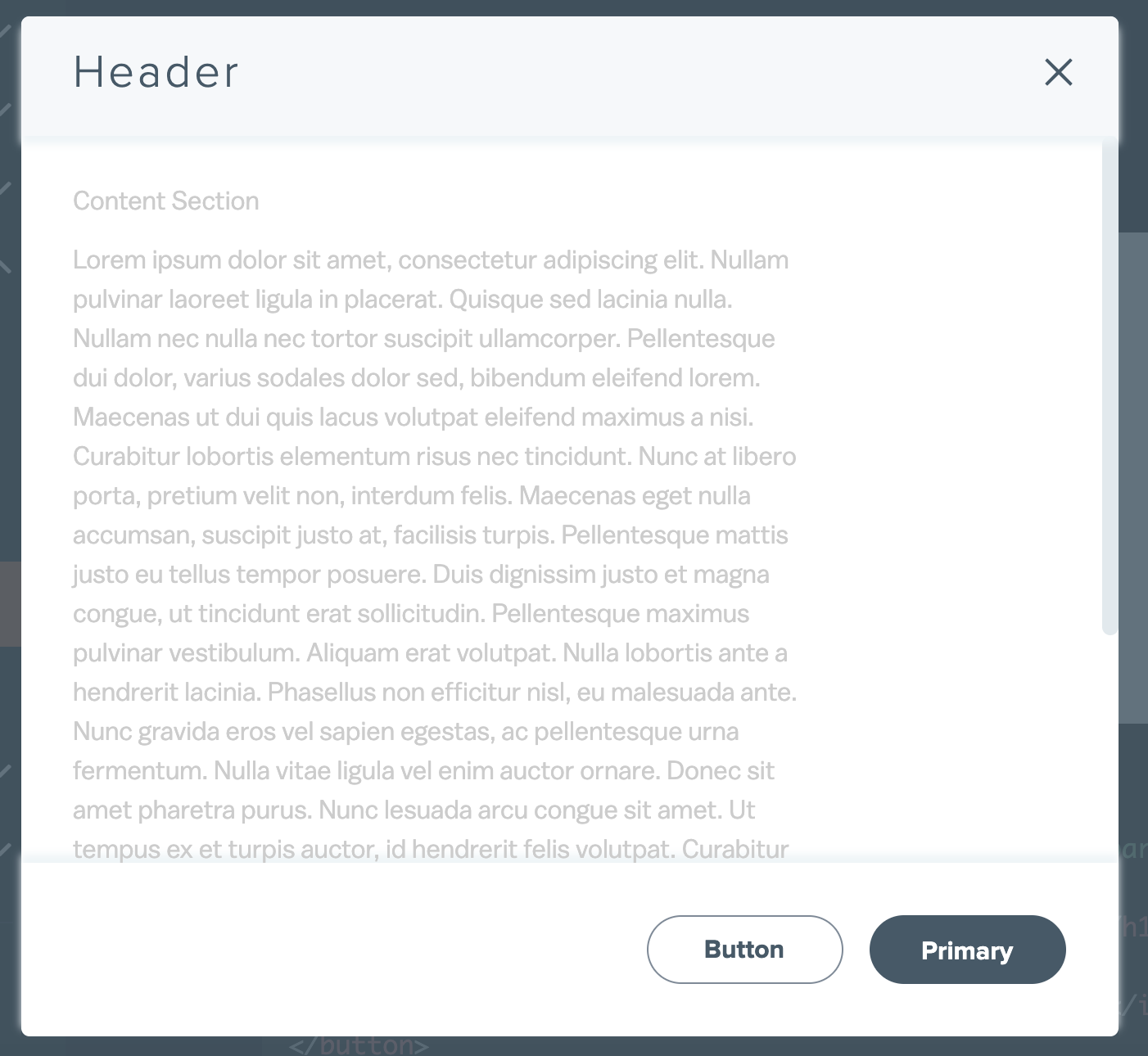
Content Section
Lorem ipsum dolor sit amet, consectetur adipiscing elit. Nullam pulvinar laoreet ligula in placerat. Quisque sed lacinia nulla. Nullam nec nulla nec tortor suscipit ullamcorper. Pellentesque dui dolor, varius sodales dolor sed, bibendum eleifend lorem. Maecenas ut dui quis lacus volutpat eleifend maximus a nisi. Curabitur lobortis elementum risus nec tincidunt. Nunc at libero porta, pretium velit non, interdum felis. Maecenas eget nulla accumsan, suscipit justo at, facilisis turpis. Pellentesque mattis justo eu tellus tempor posuere. Duis dignissim justo et magna congue, ut tincidunt erat sollicitudin. Pellentesque maximus pulvinar vestibulum. Aliquam erat volutpat. Nulla lobortis ante a hendrerit lacinia. Phasellus non efficitur nisl, eu malesuada ante. Nunc gravida eros vel sapien egestas, ac pellentesque urna fermentum. Nulla vitae ligula vel enim auctor ornare. Donec sit amet pharetra purus. Nunc lesuada arcu congue sit amet. Ut tempus ex et turpis auctor, id hendrerit felis volutpat. Curabitur elementum lacinia malesuada. Curabitur sed condimentum mauris. Fusce molestie, metus vel aliquet porta, odio lorem molestie ligula, sed vehicula risus tortor et justo. Nunc elementum libero eu condimentum scelerisque. Vestibulum tincidunt justo risus, nec gravida diam tempor sit amet. Vestibulum ultrices diam semper risus lobortis, a sodales metus accumsan. Pellentesque habitant morbi tristique senectus et netus et malesuada fames ac turpis egestas. Vestibulum diam erat, tempus sit amet scelerisque et, vehicula non metus. Curabitur tincidunt id lorem non porta. In sed neque a odio fermentum pharetra eu sed neque. Cras justo tortor, aliquam at metus eget, tincidunt hendrerit odio. Lorem ipsum dolor sit amet, consectetur adipiscing elit. Nullam pulvinar laoreet ligula in placerat. Quisque sed lacinia nulla. Nullam nec nulla nec tortor suscipit ullamcorper. Pellentesque dui dolor, varius sodales dolor sed, bibendum eleifend lorem. Maecenas ut dui quis lacus volutpat eleifend maximus a nisi. Curabitur lobortis elementum risus nec tincidunt. Nunc at libero porta, pretium velit non, interdum felis. Maecenas eget nulla accumsan, suscipit justo at, facilisis turpis. Pellentesque mattis justo eu tellus tempor posuere. Duis dignissim justo et magna congue, ut tincidunt erat sollicitudin. Pellentesque maximus pulvinar vestibulum. Aliquam erat volutpat. Nulla lobortis ante a hendrerit lacinia. Phasellus non efficitur nisl, eu malesuada ante. Nunc gravida eros vel sapien egestas, ac pellentesque urna fermentum. Nulla vitae ligula vel enim auctor ornare. Donec sit amet pharetra purus. Nunc lesuada arcu congue sit amet. Ut tempus ex et turpis auctor, id hendrerit felis volutpat. Curabitur elementum lacinia malesuada. Curabitur sed condimentum mauris. Fusce molestie, metus vel aliquet porta, odio lorem molestie ligula, sed vehicula risus tortor et justo. Nunc elementum libero eu condimentum scelerisque. Vestibulum tincidunt justo risus, nec gravida diam tempor sit amet. Vestibulum ultrices diam semper risus lobortis, a sodales metus accumsan. Pellentesque habitant morbi tristique senectus et netus et malesuada fames ac turpis egestas. Vestibulum diam erat, tempus sit amet scelerisque et, vehicula non metus. Curabitur tincidunt id lorem non porta. In sed neque a odio fermentum pharetra eu sed neque. Cras justo tortor, aliquam at metus eget, tincidunt hendrerit odio. Lorem ipsum dolor sit amet, consectetur adipiscing elit. Nullam pulvinar laoreet ligula in placerat. Quisque sed lacinia nulla. Nullam nec nulla nec tortor suscipit ullamcorper. Pellentesque dui dolor, varius sodales dolor sed, bibendum eleifend lorem. Maecenas ut dui quis lacus volutpat eleifend maximus a nisi. Curabitur lobortis elementum risus nec tincidunt. Nunc at libero porta, pretium velit non, interdum felis. Maecenas eget nulla accumsan, suscipit justo at, facilisis turpis. Pellentesque mattis justo eu tellus tempor posuere. Duis dignissim justo et magna congue, ut tincidunt erat sollicitudin. Pellentesque maximus pulvinar vestibulum. Aliquam erat volutpat. Nulla lobortis ante a hendrerit lacinia. Phasellus non efficitur nisl, eu malesuada ante. Nunc gravida eros vel sapien egestas, ac pellentesque urna fermentum. Nulla vitae ligula vel enim auctor ornare. Donec sit amet pharetra purus. Nunc lesuada arcu congue sit amet. Ut tempus ex et turpis auctor, id hendrerit felis volutpat. Curabitur elementum lacinia malesuada. Curabitur sed condimentum mauris. Fusce molestie, metus vel aliquet porta, odio lorem molestie ligula, sed vehicula risus tortor et justo. Nunc elementum libero eu condimentum scelerisque. Vestibulum tincidunt justo risus, nec gravida diam tempor sit amet. Vestibulum ultrices diam semper risus lobortis, a sodales metus accumsan. Pellentesque habitant morbi tristique senectus et netus et malesuada fames ac turpis egestas. Vestibulum diam erat, tempus sit amet scelerisque et, vehicula non metus. Curabitur tincidunt id lorem non porta. In sed neque a odio fermentum pharetra eu sed neque. Cras justo tortor, aliquam at metus eget, tincidunt hendrerit odio.
 Switch to M&T