Overview
Lists
A list groups related content together and arranges it vertically for easier readability. Two or more text labels are paired with numbers, bullets or icons to determine list style.
Variants
Too many lists in a single layout will no longer stand out. Make sure to use them only when the information needs to be more readable.
- Lorem ipsum dolor sit amet, consectetur adipiscing elit
- Euismod nisi porta lorem mollis
- Neque volutpat ac tincidunt vitae semper
Ordered List
Pairing list items with numbers helps the user recognize that the order or total number of items is important.- Lorem ipsum dolor sit amet, consectetur adipiscing elit
- Euismod nisi porta lorem mollis
- Neque volutpat ac tincidunt vitae semper
Unordered List
Pairing list items with bullets helps the user recognize that all content presented is of equal status or value.Icon List
Pairing list items with icons makes the unordered content the primary focus in a layout.Design Environment

Space Around Lists
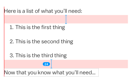
There should be a top and bottom margin of at least 24px between a list and any preceding or following text content. For ordered and unordered lists only, the entire list component should be indented 16px from the left side of the title, text content or component that precedes it. If there are no components preceding the list, the component should be indented 16px from the left side margin.

Space Between List Items
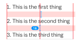
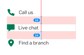
Use at least 16px of space in between each ordered and unordered list item. In icon lists, increase the space between items to 24px.Microcopy
Try to keep all items in a single list to similar line lengths. Use sentence case with no end punctuation, even if the list item is a complete sentence. If there is more than one sentence in the list item, use periods in all sentences except the last one.