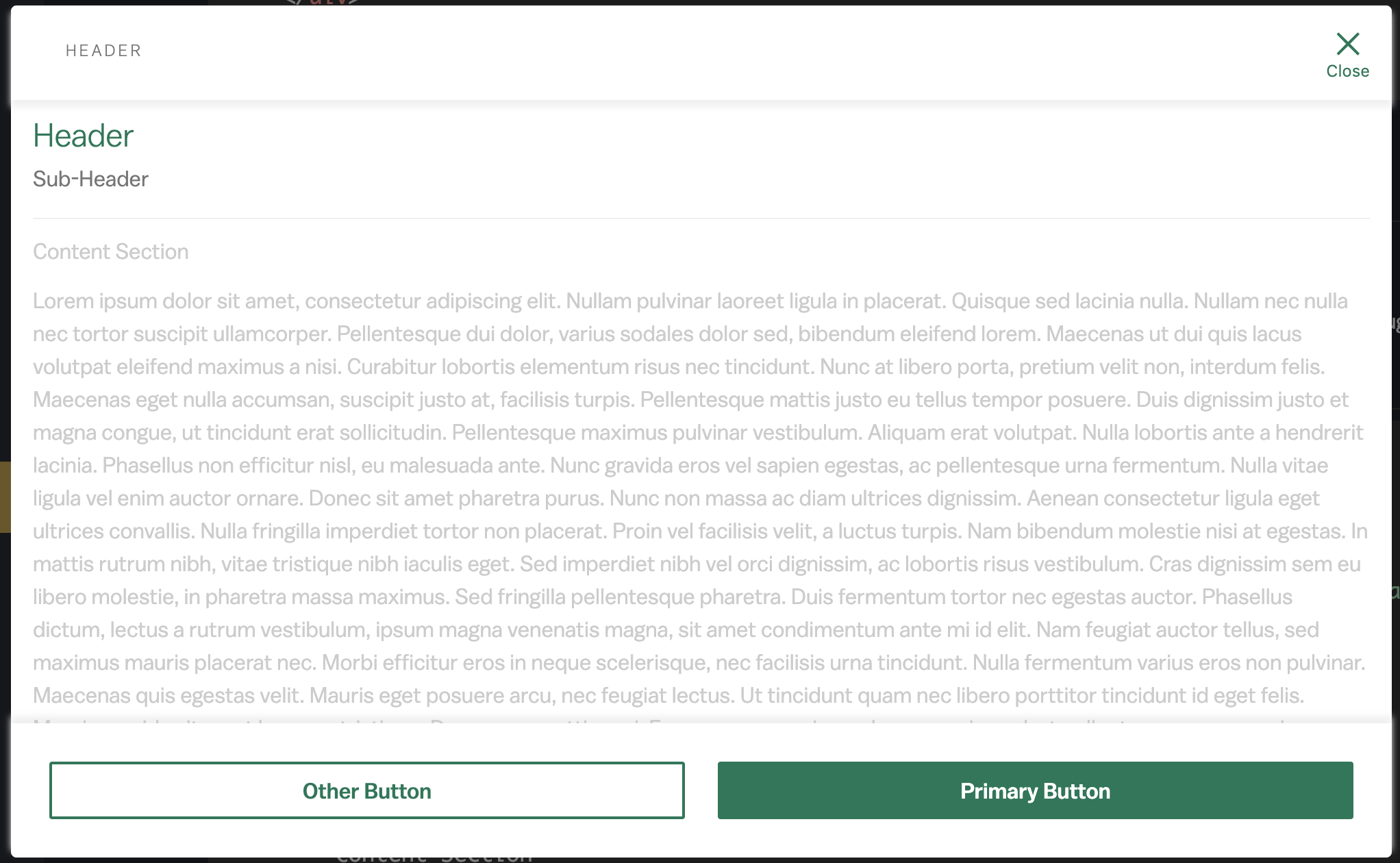
Lorem ipsum dolor sit amet, consectetur adipiscing elit. Nullam pulvinar laoreet ligula in placerat. Quisque sed lacinia nulla. Nullam nec nulla nec tortor suscipit ullamcorper. Pellentesque dui dolor, varius sodales dolor sed, bibendum eleifend lorem. Maecenas ut dui quis lacus volutpat eleifend maximus a nisi. Curabitur lobortis elementum risus nec tincidunt. Nunc at libero porta, pretium velit non, interdum felis. Maecenas eget nulla accumsan, suscipit justo at, facilisis turpis. Pellentesque mattis justo eu tellus tempor posuere. Duis dignissim justo et magna congue, ut tincidunt erat sollicitudin. Pellentesque maximus pulvinar vestibulum. Aliquam erat volutpat. Nulla lobortis ante a hendrerit lacinia. Phasellus non efficitur nisl, eu malesuada ante. Nunc gravida eros vel sapien egestas, ac pellentesque urna fermentum. Nulla vitae ligula vel enim auctor ornare. Donec sit amet pharetra purus. Nunc non massa ac diam ultrices dignissim. Aenean consectetur ligula eget ultrices convallis. Nulla fringilla imperdiet tortor non placerat. Proin vel facilisis velit, a luctus turpis. Nam bibendum molestie nisi at egestas. In mattis rutrum nibh, vitae tristique nibh iaculis eget. Sed imperdiet nibh vel orci dignissim, ac lobortis risus vestibulum. Cras dignissim sem eu libero molestie, in pharetra massa maximus. Sed fringilla pellentesque pharetra. Duis fermentum tortor nec egestas auctor. Phasellus dictum, lectus a rutrum vestibulum, ipsum magna venenatis magna, sit amet condimentum ante mi id elit. Nam feugiat auctor tellus, sed maximus mauris placerat nec. Morbi efficitur eros in neque scelerisque, nec facilisis urna tincidunt. Nulla fermentum varius eros non pulvinar. Maecenas quis egestas velit. Mauris eget posuere arcu, nec feugiat lectus. Ut tincidunt quam nec libero porttitor tincidunt id eget felis. Mauris gravida sit amet lacus ac tristique. Donec nec mattis orci. Fusce semper enim sed neque euismod, at pellentesque purus varius. Curabitur vel eros quis metus lobortis maximus. Nam venenatis, ex vel consequat pharetra, est metus fringilla mi, vitae posuere libero justo eu diam. Fusce interdum auctor nisi non maximus. Sed a nunc vestibulum, placerat tellus id, convallis dolor. Pellentesque sed tortor augue. Fusce sed ipsum leo. Sed vel metus nisl. Nulla euismod fringilla lectus, id condimentum lacus pellentesque vel. Maecenas tristique facilisis porttitor. Duis et odio augue. Integer ante ex, pulvinar nec augue et, mollis semper urna. Etiam maximus dignissim est, quis feugiat tellus ullamcorper non. Maecenas id erat justo. Class aptent taciti sociosqu ad litora torquent per conubia nostra, per inceptos himenaeos. Duis sollicitudin, velit non euismod dictum, mauris lectus efficitur lectus, condimentum accumsan ante enim vitae quam. Morbi quis est id massa condimentum mollis. Aenean quis libero rutrum, luctus tortor id, lobortis felis. Maecenas non hendrerit neque, vel maximus quam. Cras fringilla malesuada tortor in viverra. Sed mollis imperdiet velit. Nullam sodales mauris sed erat placerat, sed blandit est tempus. Nullam nec mauris nibh. Vestibulum et diam vel leo accumsan malesuada. Nam tincidunt finibus velit, at varius lacus faucibus a. Nulla in varius dolor, a viverra dolor. Pellentesque et tempus diam, ut aliquam diam. Etiam metus sem, pretium ac lorem et, feugiat blandit massa. Cras ut nibh urna. Morbi nec gravida mi. Phasellus at porta tellus. Aenean vulputate at enim eget sollicitudin. Cras vulputate enim ligula, et tincidunt metus porttitor id. Fusce facilisis metus diam, et dictum eros lobortis ullamcorper. Quisque cursus ex vel turpis blandit varius. Pellentesque lobortis imperdiet mi, maximus aliquam mi eleifend et. Etiam rutrum ante eget quam posuere dictum. Praesent mi lorem, finibus id dolor et, laoreet bibendum sapien. Ut commodo placerat dolor eu gravida. Duis non tempus risus. Nunc euismod euismod congue. Nunc accumsan ut diam sit amet pellentesque. Morbi sit amet diam magna. Pellentesque interdum nisl at libero malesuada, sit amet varius quam consequat. Curabitur at ultricies enim. Nullam accumsan gravida dolor, vel pulvinar nisl semper in. Suspendisse elementum risus dolor, convallis imperdiet purus tempor id. Nulla mattis congue diam. Nam arcu tellus, maximus ac aliquet sit amet, varius pulvinar ex. Quisque at nunc quam. Aenean sed justo condimentum, consequat nunc venenatis, dapibus mi. Nulla sit amet nulla lorem. Pellentesque vestibulum sollicitudin nisl a hendrerit. Duis dolor sem, accumsan eu tellus sed, commodo porta orci. Cras ut feugiat enim. Quisque vulputate commodo magna id pellentesque. Sed id consequat sem. In hac habitasse platea dictumst. Aliquam vestibulum fringilla nunc ut posuere. Proin a ipsum eu urna tempus porttitor. Nam lacinia justo libero, at blandit metus pretium et. Donec accumsan lectus in nibh consectetur, rutrum interdum magna tristique. Donec fermentum tortor ut leo suscipit, vitae tempus tortor viverra. Mauris id nulla rhoncus purus viverra tincidunt vel non libero. Fusce mollis eros ut neque fermentum, a condimentum odio accumsan. Phasellus ante enim, fermentum eget consectetur ac, mollis a sapien. Aenean vestibulum diam eu risus consequat congue. Sed congue eros eu ipsum maximus eleifend. Aliquam sit amet eleifend felis, at auctor est. Nullam pharetra, magna ut convallis rhoncus, justo est feugiat ipsum, molestie blandit nulla dolor in arcu. Donec magna nisl, ornare vitae dui non, eleifend convallis est. Sed porttitor aliquet massa blandit condimentum. Nunc et leo nibh. Interdum et malesuada fames ac ante ipsum primis in faucibus. Pellentesque non hendrerit erat. Nullam ultricies, mi non accumsan tristique, mi metus convallis nunc, id tristique augue nisi ac ex. Aliquam non tincidunt metus. Vestibulum rutrum neque odio, at malesuada arcu congue sit amet. Ut tempus ex et turpis auctor, id hendrerit felis volutpat. Curabitur elementum lacinia malesuada. Curabitur sed condimentum mauris. Fusce molestie, metus vel aliquet porta, odio lorem molestie ligula, sed vehicula risus tortor et justo. Nunc elementum libero eu condimentum scelerisque. Vestibulum tincidunt justo risus, nec gravida diam tempor sit amet. Vestibulum ultrices diam semper risus lobortis, a sodales metus accumsan. Pellentesque habitant morbi tristique senectus et netus et malesuada fames ac turpis egestas.
 Switch to Wilmington