 Switch to Wilmington
Grid System
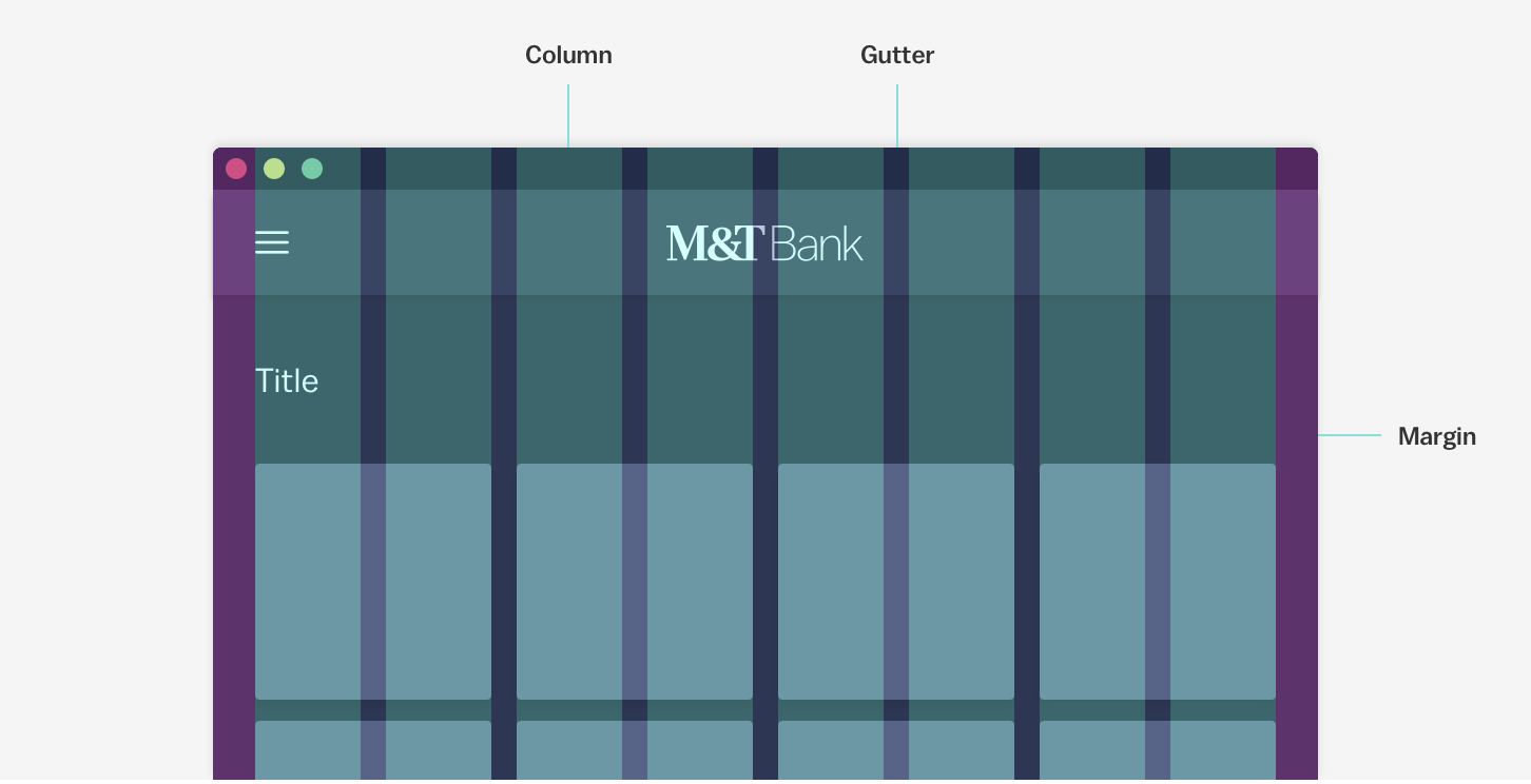
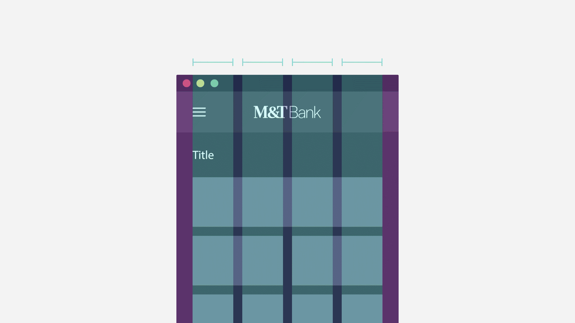
A consistent grid system allows for a predictable and approachable experience across products that creates a familiar visual structure and centers the content the user came for.
The system is comprised of columns, gutters and margins that define the grid as well as the breakpoints that definte its bounds. The Currency grid system is mobile-first and flexibly designed to accommodate various layout requirements while ensuring visual rhythm.
Breakpoints
Breakpoints are bounded by min and max-width attributes. Screens in between the min and max width values will inherit all dimensions of the max-width. Depending on the type of grid you use, this will affect the size of your layout or the size of the surrounding margins.
| Breakpoint | Device | Breakpoint Range |
|---|---|---|
| xsmall | Mobile | 0-374px |
| small | Mobile | 375-575px |
| medium | Tablet | 576-767px |
| large | Tablet | 768-991px |
| xlarge | Desktop | 992-1199px |
| xxlarge | Desktop | 1200-1439px |
Customizing Columns, Gutters and Margins
Currency defines a standard set of breakpoints to bound the grid, however layout decisions such as the number and size of columns (up to twelve), size of gutters and margins, as well as the type of grid to employ, are up to a designer’s discretion.
For ease of development handoff, best practice is to use a number of columns in factors of twelve. To give the content on your page a sense of framing, include page margins at least one size larger than the gutter.
Use consistent vertical spacing in additon to your application of the grid to create a smooth and predictable visual flow. Refer to our spacing guidelines for Currency standard spacing values to apply to your designs.
Grid Types
Fixed Grid
The fixed grid has a maximum width at each breakpoint range and responsive page margins. This grid prioritizes readability and is best used in content-specific pages with simple layouts.
Fluid Grid
The fluid grid has responsive columns in between each breakpoint and the layout can adapt to the available screen real estate. Fluid grids are ideal for more complex layouts, such as dashboards, where scaling the size of individual components is more useful than seeing more content on the page.
