 Switch to Wilmington
Input Field
The input field pattern prompts and collects information from users as part of a form. The default elements are a label and one of the standard input components. Add the "Optional" label when the input field is not required. Use a Help Link variant of the icon link to communicate additional information when it won't fit in the interface. The caption provides the user with more information than can fit in the label, including tips and notes. Using a caption is optional, but can give the user more context for how to fill in the field.
Variants
Lorem ipsum dolor...
Used to capture a single line of information through the text input component.
Lorem ipsum dolor...
Used to capture multiple lines of information through the text area component.
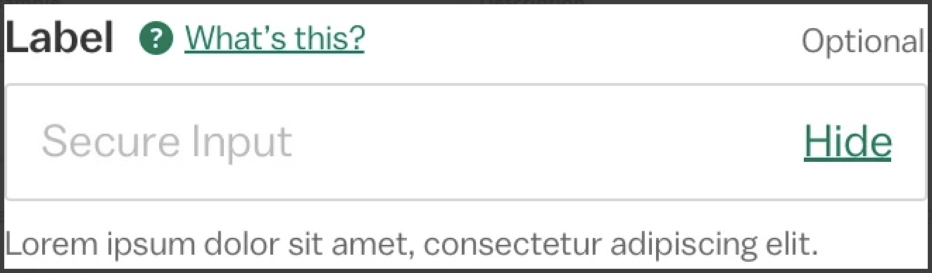
Used to capture sensitive information, such as a password, through the text input component. The "Show/Hide" toggle allows the user to view their input.
Lorem ipsum dolor...
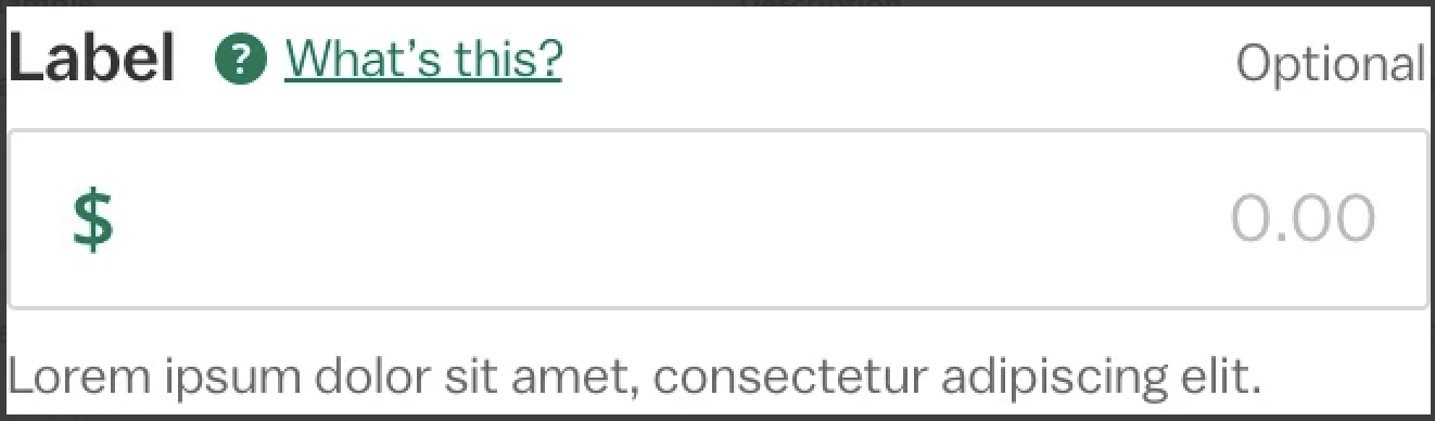
Used to capture numerical information that includes a decimal point through the text input component. The optional icon signals to the user what type of information is being requested, such as a currency amount or a percentage.
Lorem ipsum dolor...
Used to capture a single, predefined response through the select component.
Lorem ipsum dolor...
Used to capture a single, predefined response through the button group component.
Used to capture a single, predefined response through the radio component.
Used to capture a multiple predefined responses through the checkbox component.
Design Environment
Form action groups will default to the persistent position, but can be placed in-scroll if that works better for the design. Use nested columns in tablet and desktop views to make the most of the horizontal form space. For long forms that can be divided into multiple steps, consider using a step guide pattern.
Microcopy
The optional label will always be "Optional" and the secure input toggle will always be "Show" and "Hide" with the optional Eye Open/Eye Closed icons. Write captions in full sentences and stay focused on the overall prompt. Use sentence case with end punctuation. Otherwise, follow the microcopy guidelines for the general label component and the appropriate input component.