 Switch to Wilmington
This component is not yet coded. For questions or to offer development contribution, please reach out to the Currency team
Overview
Thumbnail
Thumbnails display a small preview image that represents an object. The default structure includes an image and a container edged with a solid stroke. The button variant allows each image to accommodate an additional action.
Variants

Standard
Used for thumbnails without an associated action, or when "select" is the only action. The image becomes the clickable area for the select action.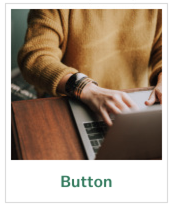
With Action
Used for thumbnails with an additional action, such as "Edit" or "Delete". The button becomes its own clickable area, separate from the "Select" action, if applicable.States
If including an additional action, the button has the same states as the general button component. The state for the image are as follows:

Loading, spinner
Used to indicate that a thumbnail image is loading.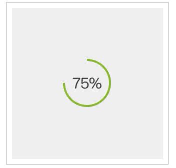
Loading, percentage
Used to indicate what percentage of a thumbnail image has loaded, when feasible.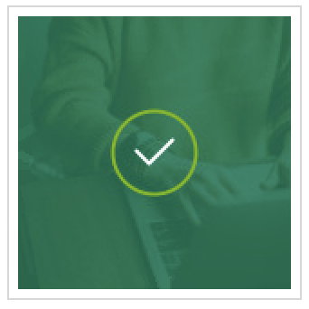
Selected
Used to indicate that a thumbnail image is selected, when applicable.
Hover
Used on hover to indicate that it's possible to select a given thumbnail image, when applicable.Design Environment
Space thumbnail components 16px apart. Make sure all thumbnails in a single set have the same button and select action, if any. Only one button per thumbnail.
Microcopy
Keep button text concise and applicable to the image. Otherwise, follow micrcopy guidelines for the general button component.