 Switch to Wilmington
Upload Field
The upload field pattern prompts users to submit images and files as part of a form. The default elements are a label and an upload container. Add the "Optional" label when the upload field is not required. Use a Help Link variant of the icon link to communicate additional information when it won't fit in the interface. The caption is optional, but can give the user more context for how to fill in the field.
States
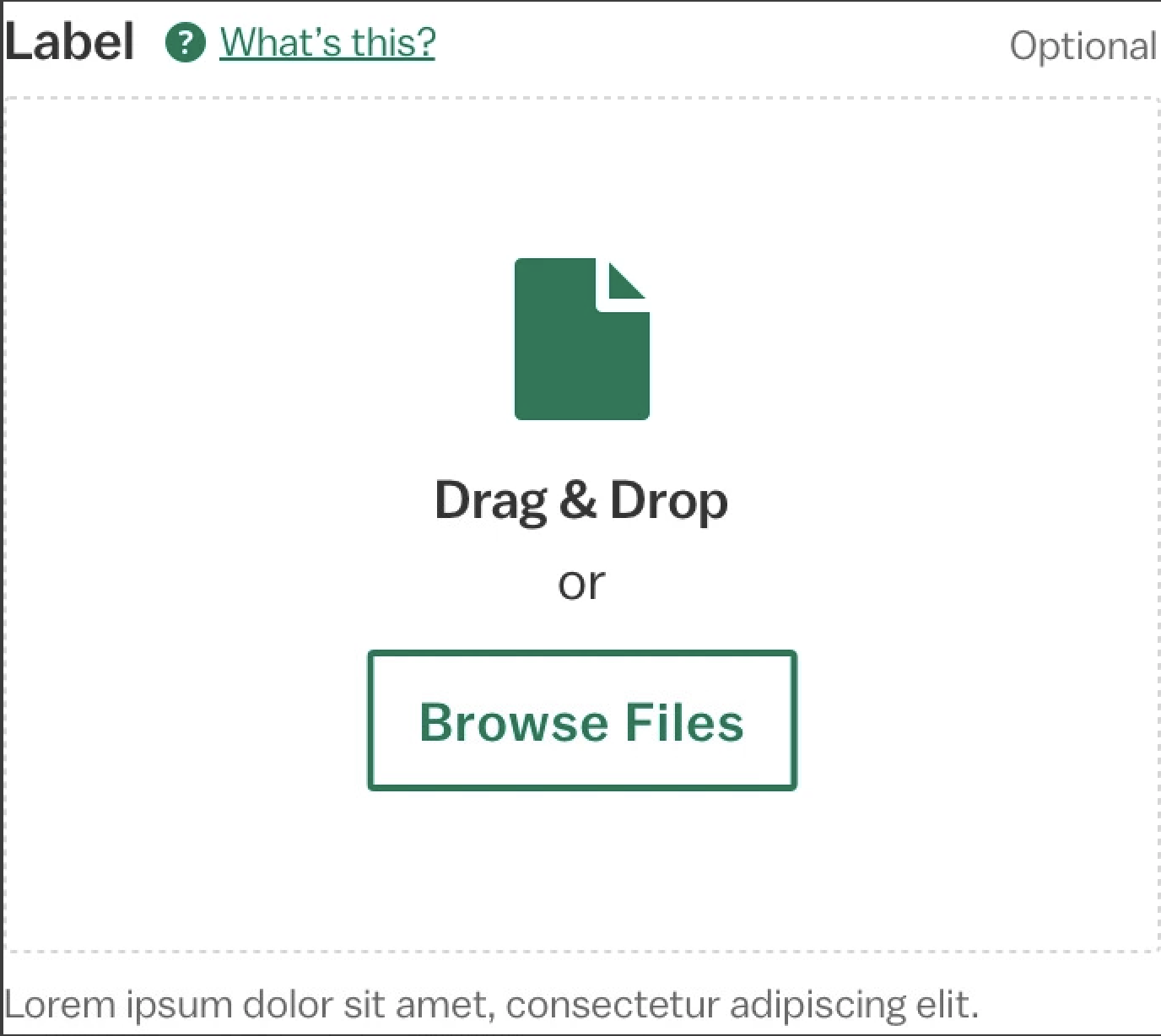
Signals that the user can drag files into the dashed container or use the "Browse Files" button to open their device's native file picker.
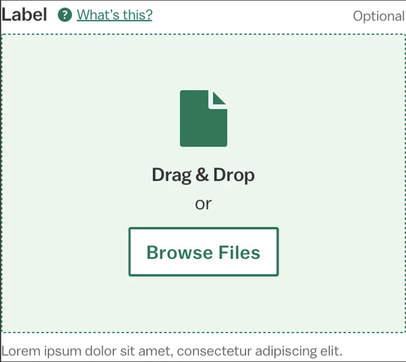
Signals that the dragged files will upload once dropped. The hover state only appears when files are dragged over the dashed container, not on mouseover.
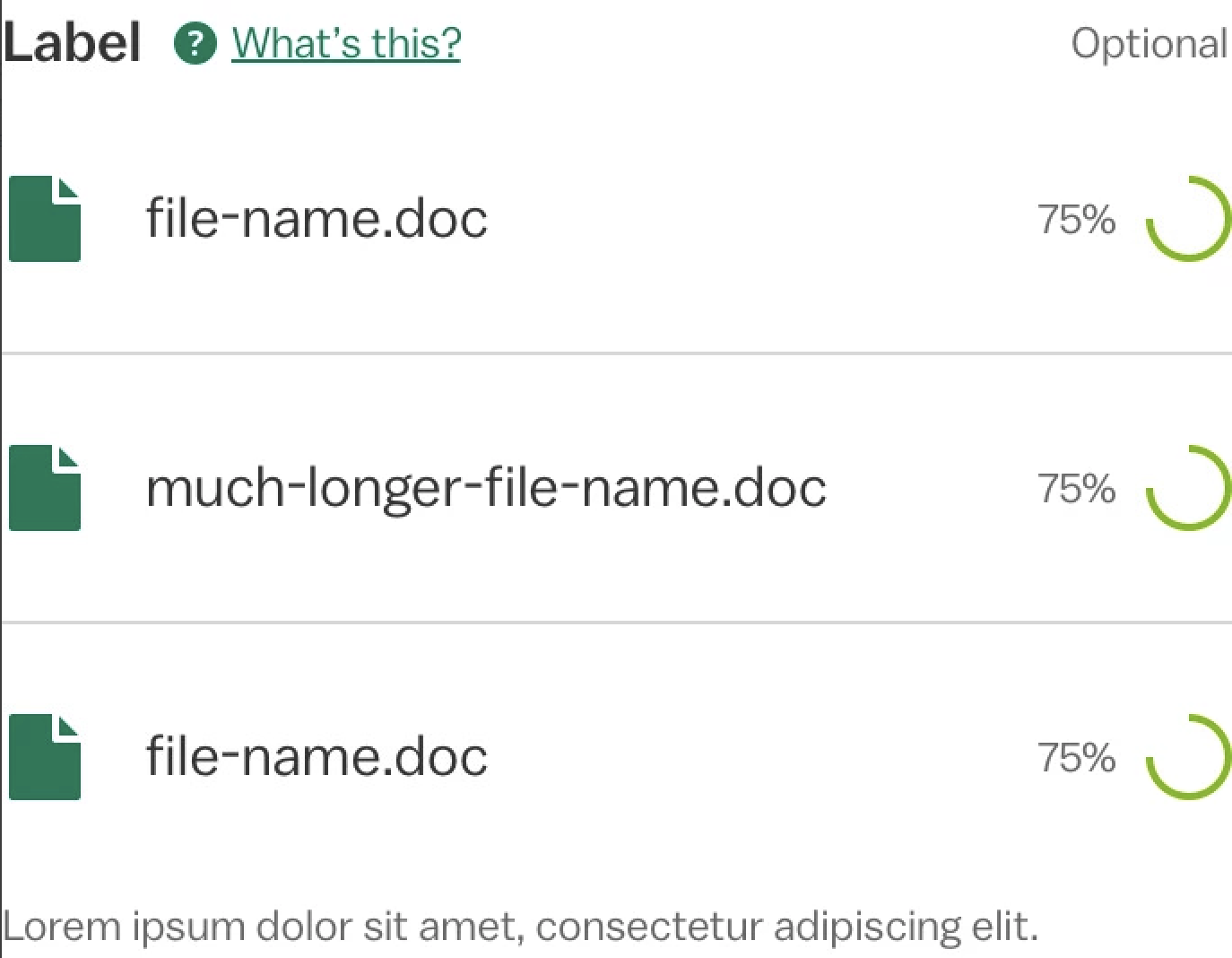
Signals that the dropped or selected files have begun uploading. The spinner will display a progress percentage when feasible.
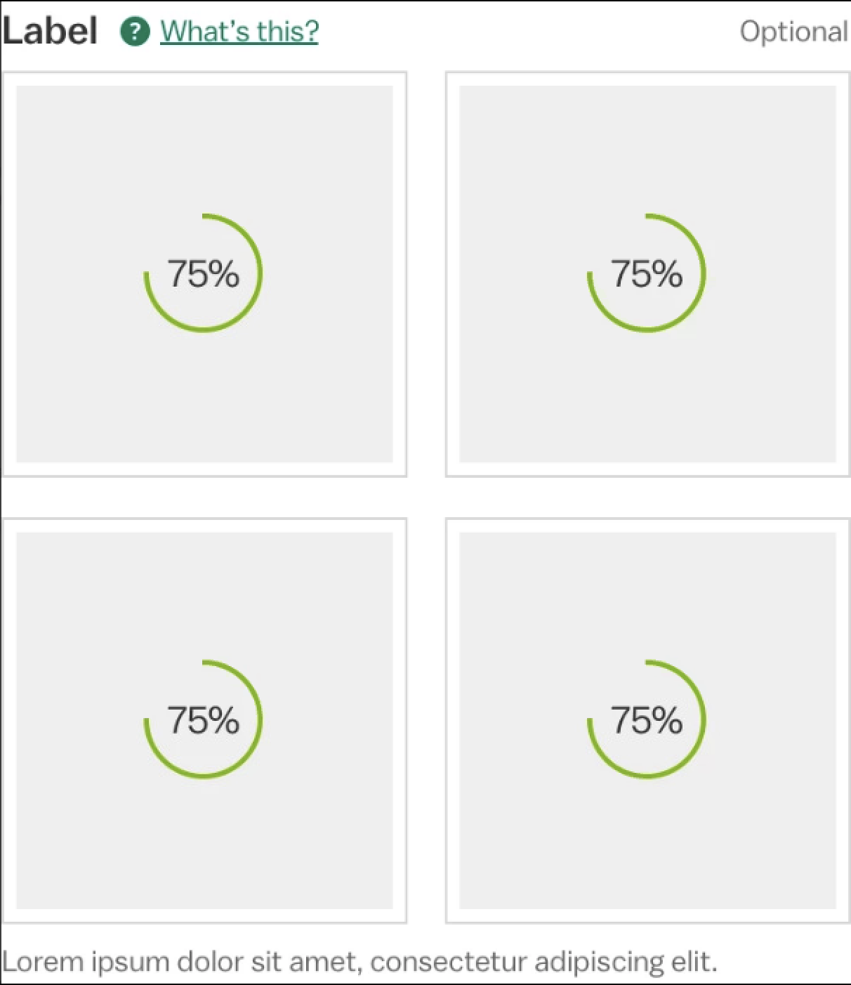
Signals that the dropped or selected images have begun uploading. Each image behaves like the thumbnail loading state.
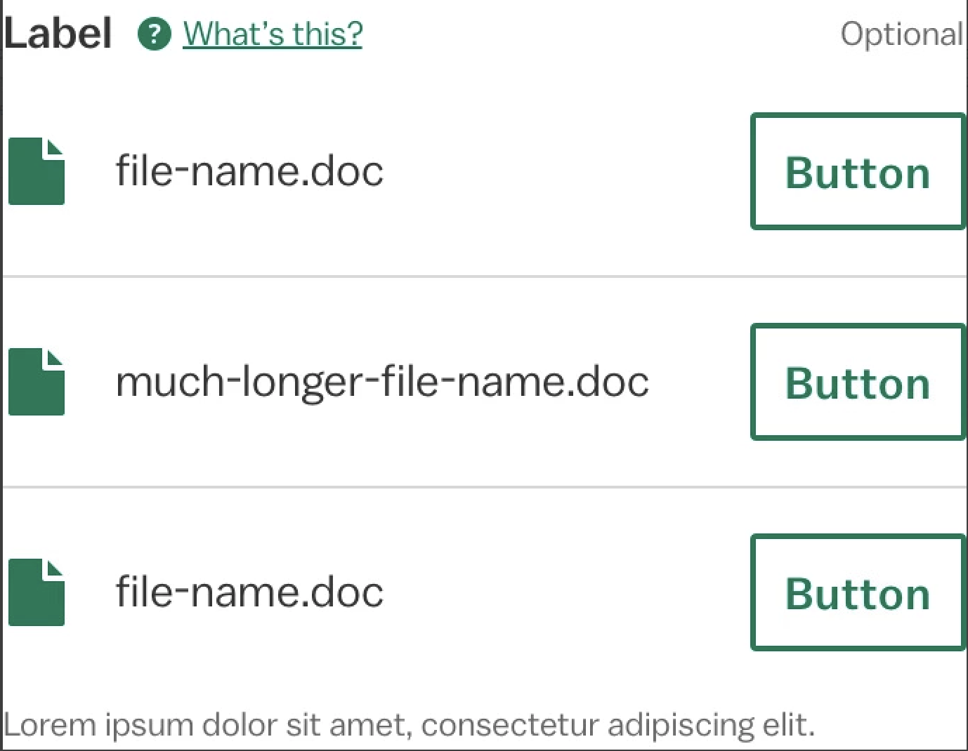
Signals that files have finished uploading. The button in this state is optional, but will pair an action with each file, such as "Edit" or "Delete".
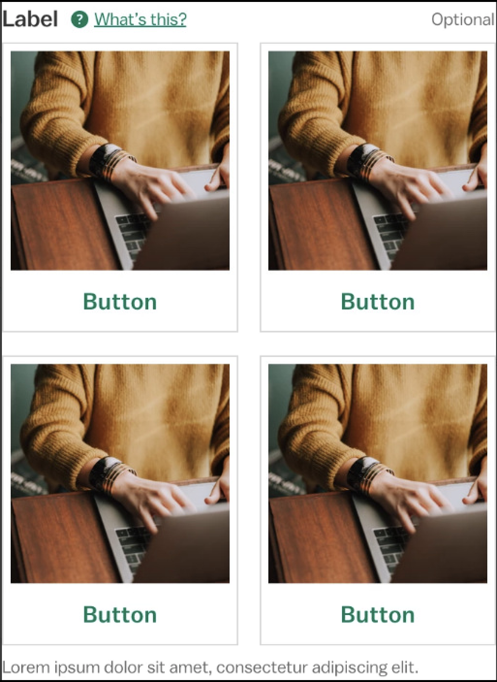
Signals that images have finished uploading. Each image behaves like the thumbnail loading state.
Design Environment
Form action groups will default to the persistent position, but can be placed in-scroll if that works better for the design. Use nested columns in tablet and desktop views to make the most of the horizontal form space.
If a form calls for more than one upload field, consider separating them on different pages or in a step guide. The icon, text and button included in the default state appear on a single line on tablet and desktop. In mobile view, they stack. The width of the pattern fits four thumbnails across on tablet and desktop and two across in mobile.
Microcopy
The optional label will always be "Optional" and the text and button label in the default state will always be "Drag & Drop" or "Browse Files". Otherwise, follow the guidelines for the icon link, label and thumbnail.